It began with childhood scribbles. It became a foundry.
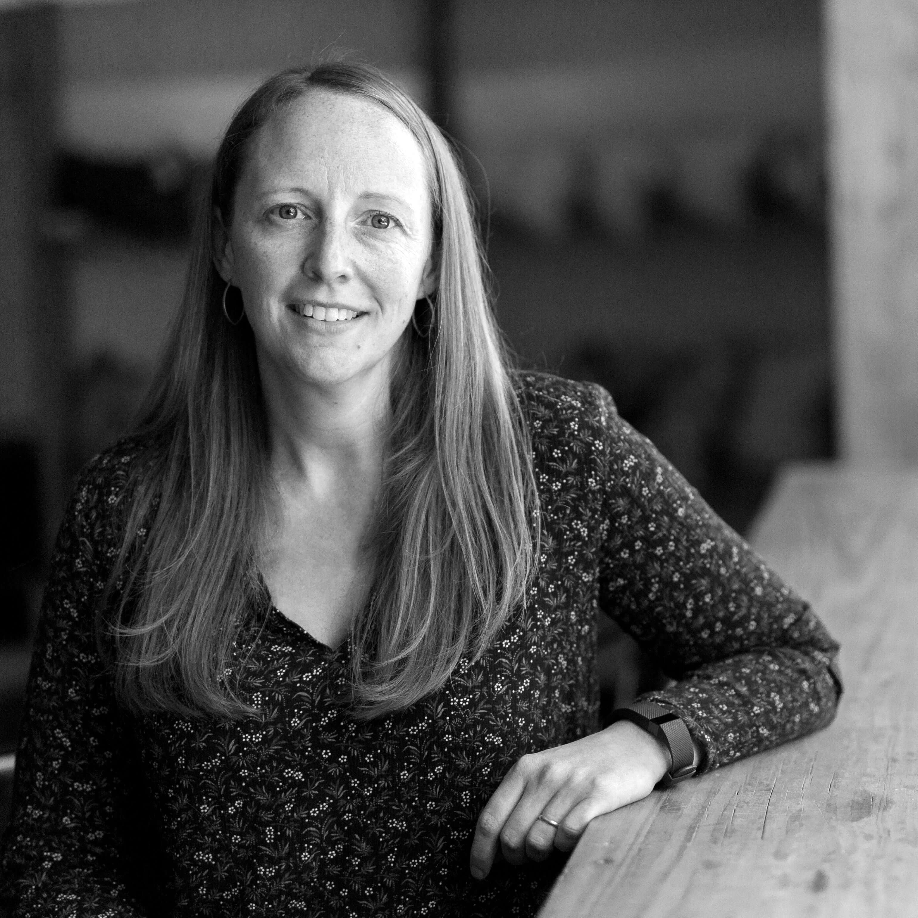
Hi, I'm Julie Green — type designer, lettering artist, and founder of Up Up Creative. I draw, code, and design fonts that help creatives, brands, and publishers bring their ideas to life with clarity, personality, and a little edge.
Since releasing my first typeface in 2015, I’ve built a catalog of 30+ expressive, functional fonts — thoughtfully made, packed with OpenType features, and used by everyone from indie designers to global brands.
Evolution of a Type Designer
The early 1980s
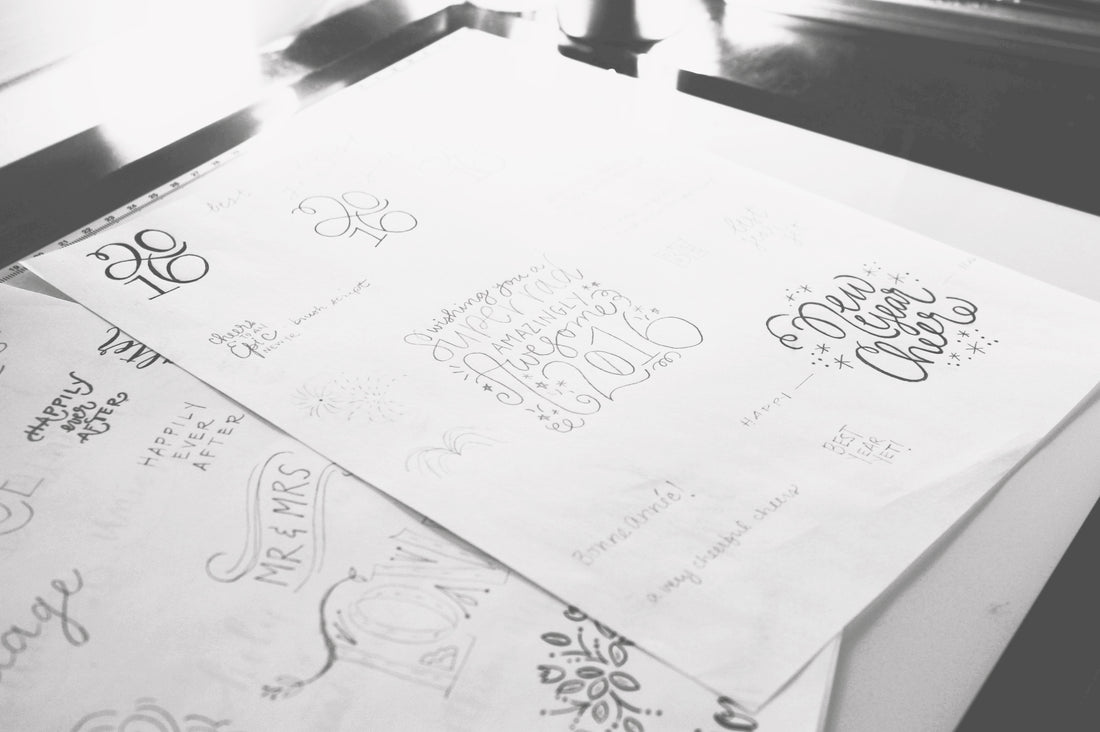
I learned to read and write when I was pretty young, and if you look through any book from my childhood, you'll find it absolutely filled with writing practice. Words and letters fill the endpapers and the margins.
The mid-1990s
In school, friends called me Julie Twelve — a nod to Times 12, the font we always had to use to type our term papers and assignments — because they said my handwriting looked like a font in Microsoft Word.
1997-2007
My academic years were both training for and an atypical path to my type design career. I studied visual communication, worked in IT writing Java and C++, then landed in grad school for English working toward my Ph.D.
2008
Pursuing that degree was fun — but not what I wanted long-term. So I quit. Realizing I needed a career with more personal and creative freedom, I launched Up Up Creative as a graphic design business and never looked back.
2008-2015
Over the next several years, I built Up Up Creative into a pretty successful graphic design business, seeing my work featured in magazines like Martha Stewart Living and BRIDES. I also started to rely pretty heavily on my own handlettering in my design work.
2015
After meeting a professional type designer (wait, that's a thing?!), I was obsessed. I launched my first typeface, Bundt Cake, and was hooked. It didn’t make a ton of money, but it did well enough that I knew I could eventually build a career in type design.
2015-2025
Over the next decade, I phased out client work to focus entirely on letters — studying type, drawing characters, honing my craft, and building fonts. In ten years, I published 31 typefaces, ranging from playful scripts to refined serifs to modern sans serifs.
Now
These days, I design fonts that are expressive yet functional — that support your work, not distract from it. Whether you’re working on brands, books, or big ideas, I create type that helps your message come through clearly, beautifully, and with a little edge.
Trusted by the people behind what you watch, read, and love.
Behind the "Up Up Creative" Name
When I first started setting up an Etsy shop back in 2008, I was home with my toddler and narrating everything to him (as you do). One day I asked him what I should call my shop. He said “up up,” because he wanted to be picked up. I thought it was actually pretty cute, and frankly I had no better ideas, so I went with it. 😂
Over the years, I’ve considered rebranding — maybe to my own name, or even to “Julie Twelve” once I'd really settled into full-time type design — but by the time I seriously thought about it, I’d already built Up Up Creative into a brand people know. And honestly, my toddler is now a college student (how?!), but the name still feels right.
Personal-ish FAQs
I’ve got a proper FAQ page for all of your font-related questions, but this is the spot for Julie-related stuff. I’ll keep it brief.
What’s your favorite font you’ve designed?
What’s your favorite font you’ve designed?
The truest answer is: whichever one I just finished. Beyond that, it depends on my mood and the project.
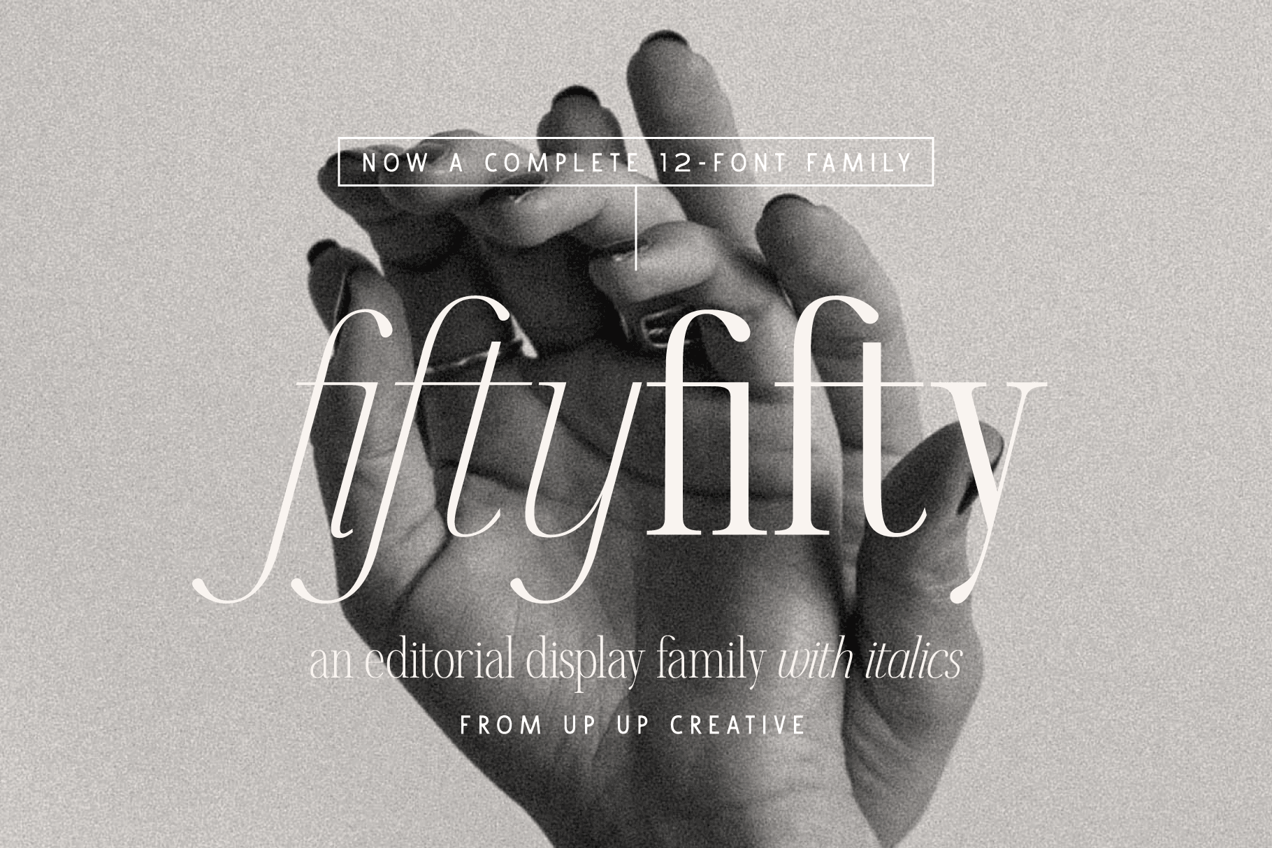
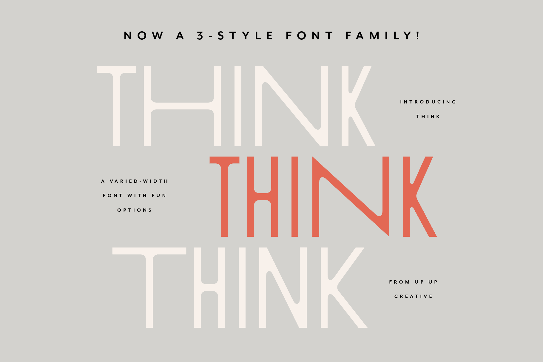
That said, Slight was the first font that earned thousands instead of hundreds of dollars. Think has landed me the coolest licenses (hi there, Apple Original Films). And Fifty Fifty might be the one that best represents me as a type designer.
How do you name your fonts?
How do you name your fonts?
Honestly? Naming fonts is so hard. To publish with Monotype or MyFonts, I can’t use any name that’s ever been used for a font — across all time. (Thankfully, there’s a database for that.)
I usually start by choosing a few favorite letters or ligatures from the font and trying to build a name around those. I look for names that are easy to spell, memorable, and not secretly a terrible slang word in another language.
Also, just for fun, I'm slowly trying to have at least one font named with each letter of the alphabet. At the time of this writing I'm still missing fonts that start with J, L, N, O, Q, U, X, and Y. But I’ll get there.
Do you ever get sick of looking at letters?
Do you ever get sick of looking at letters?
Honestly? Never.
Kerning, though? Oh yeah.
Can you help me with my font?
Can you help me with my font?
I actually cover this more thoroughly in the real FAQ, but here’s the short version: designing fonts takes up a lot of time and energy. So while I’m totally open to helping you with your font, I’ll have to charge you actual money (haha, but also not kidding). The good news? I’ve created a few different ways we can work together — all outlined over in the other FAQ.
Why yes, this site uses my fonts
Bundt Cake kicked off my whole entire type design career, so of course it earned the logo gig (with one modification).
Daily Sans gives the body and headings clarity and structure — clean lines, strong presence, no fuss.